

Buttons had bodies. Cameras had mechanical sounds. Phones had keyboards. Cars had keys, switches, and physical dials. Then design began making things disappear, one by one. This isn't a story about what we lost. It's about the moment design realized that sometimes its greatest achievement is something the user no longer needs to see.
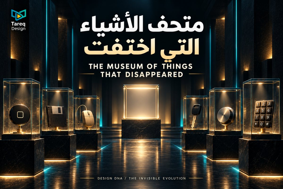
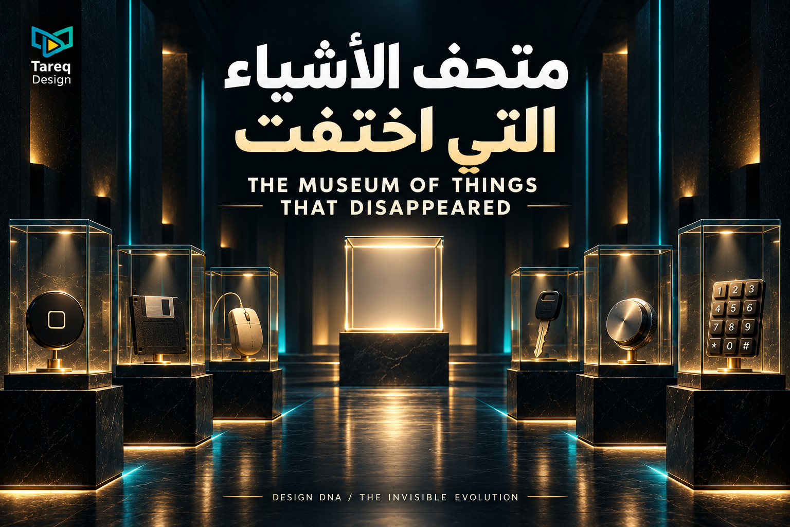
Welcome to a rather unusual museum.
Everything here was once an ordinary part of our lives.
We pressed it.
Turned it.
Pulled it.
Waited for it.
Then one day...
it disappeared.
The strange part?
Its function often remained.
ROOM 01
The Button That Needed to Feel Like a Button
Buttons used to be obvious.
They had depth.
Edges.
Shadows.
And when pressed...
they moved.
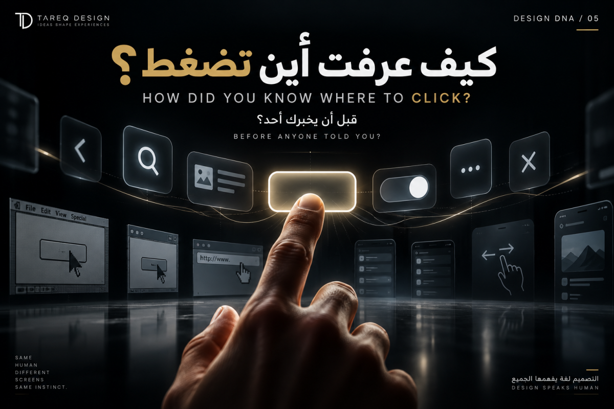
When screens arrived, we initially copied the physical world.
Digital buttons looked plastic.
We added highlights, gradients, bevels and shadows.
The interface was essentially saying:
This is a button. Press it.
Then users learned the language.
And designers began removing things.
The shine disappeared.
The depth disappeared.
Sometimes even the border disappeared.
What remained might be nothing more than a word or an icon.
The fascinating part isn't simply that design became more minimal.
Users became more visually literate.
Design no longer needed to explain itself in quite the same way.
ROOM 02
An Icon for Something That No Longer Exists
Here lies an even stranger artifact.
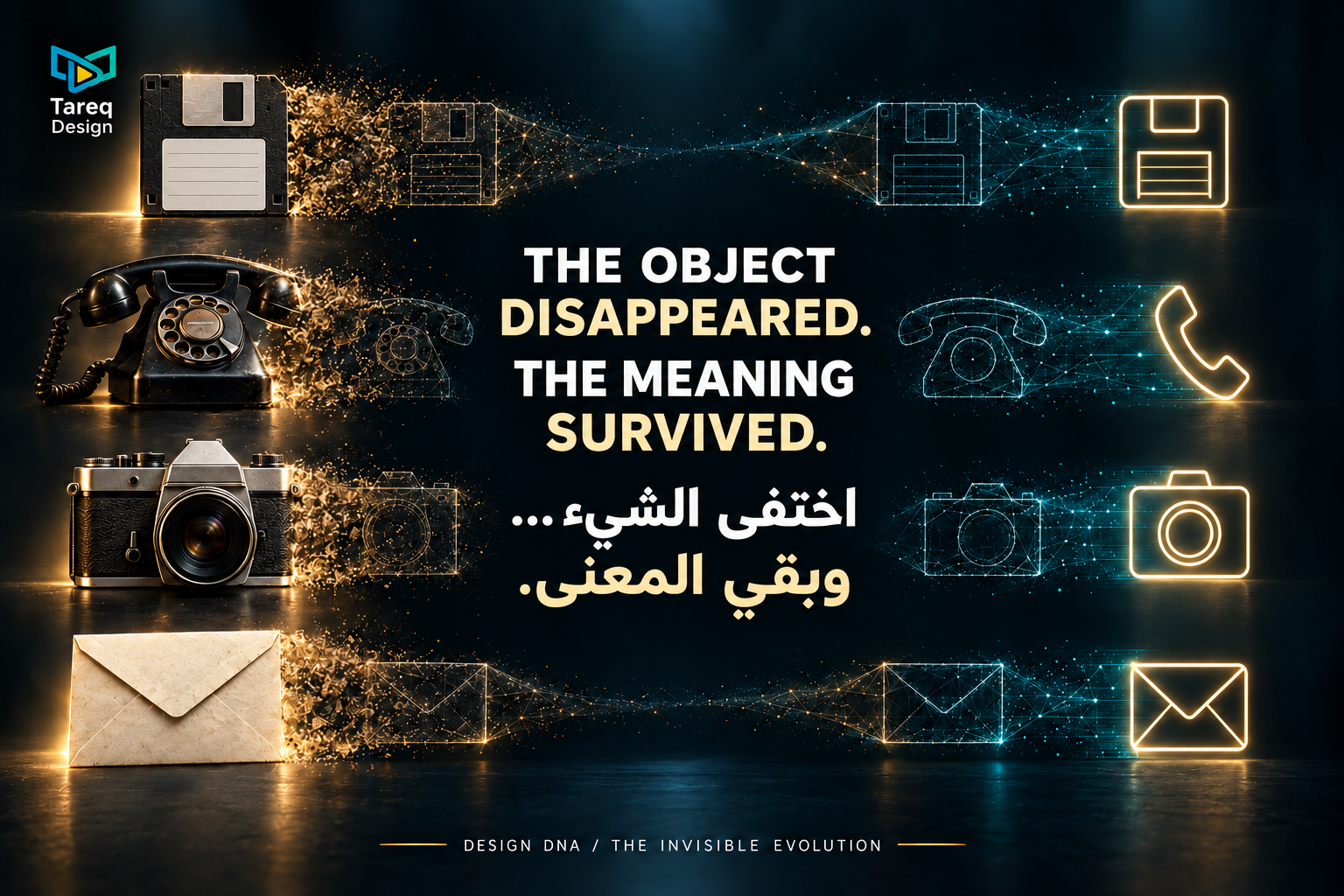
💾
Entire generations click this symbol...
even though many may never have held an actual floppy disk.
The object disappeared.
Its meaning survived.
This reveals something beautiful about design:
Objects can die physically and survive linguistically.
Your smartphone camera doesn't need to resemble an old film camera.
Yet the camera silhouette still communicates photography.
Phones no longer have separate handsets.
Yet their shape still means "call."
Design doesn't always preserve objects.
Sometimes...
it preserves their ghosts.
ROOM 03
The Day the Home Button Disappeared
For years, smartphones had something reassuring beneath the screen.
One button.
No matter how lost you became...
press it.
Then it disappeared.
At first, it felt as though something fundamental had been removed.
But its function survived.
It became a gesture.
The object became movement.
And that represents an important transition in design:
Object → Symbol → Gesture
Something we could see...
became something we understood...
then became an action that didn't even need to remain visible.
The interface was beginning to escape the screen.
ROOM 04
When Everything Became the Screen
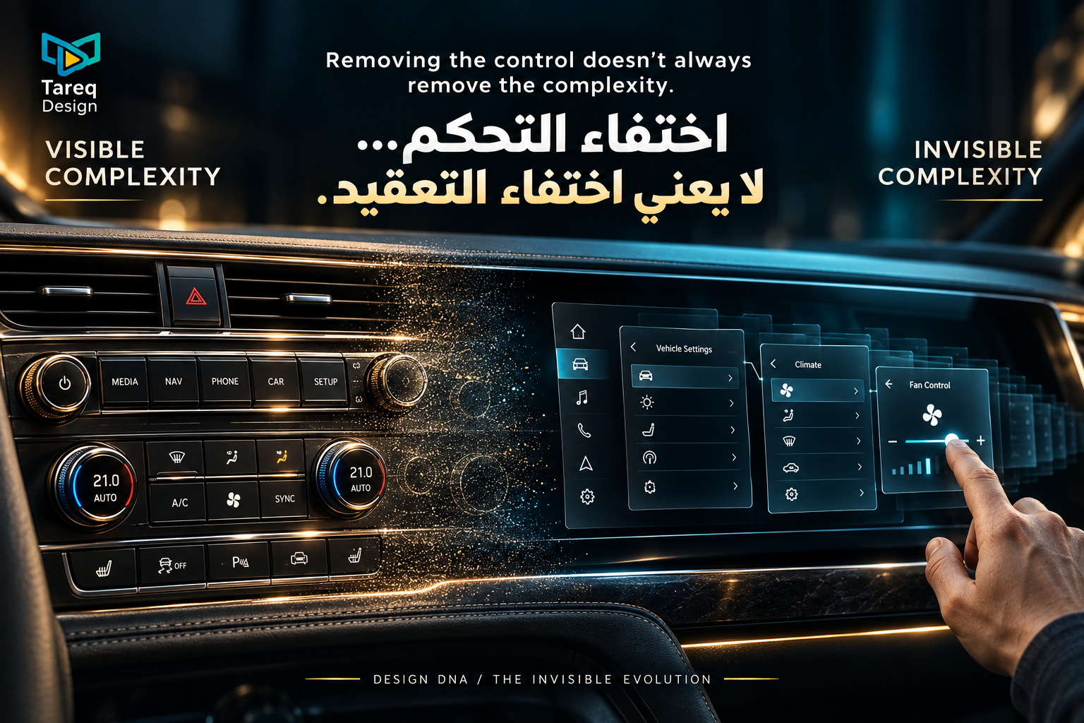
Look inside an older car.
Gauges.
Switches.
Dials.
Buttons.
Levers.
Almost every function had its own physical body.
Then the screen arrived.
And started swallowing them.
Music.
Navigation.
Climate.
Phone controls.
Vehicle settings.
The same thing happened to cameras, phones and music players.
Dozens of physical objects became...
one programmable surface.
We gained enormous flexibility.
But perhaps we lost something too:
touch.
Not Everything That Disappears Is Progress
There's another room in this museum.
It celebrates nothing.
Because removal isn't automatically good design.
Hide a control users need...
and you haven't created minimalism.
Put an important function three menus deep...
and you haven't simplified anything.
Replace a physical control someone can operate without looking with a touchscreen requiring visual attention...
and perhaps you've merely moved complexity.
From the product...
into the user's mind.
Great design doesn't simply ask:
What can I remove?
It asks:
What can I remove without making the human pay for it?
THE FINAL ROOM
We've reached the end of the museum.
No floppy disk.
No button.
No key.
No screen.
Only...
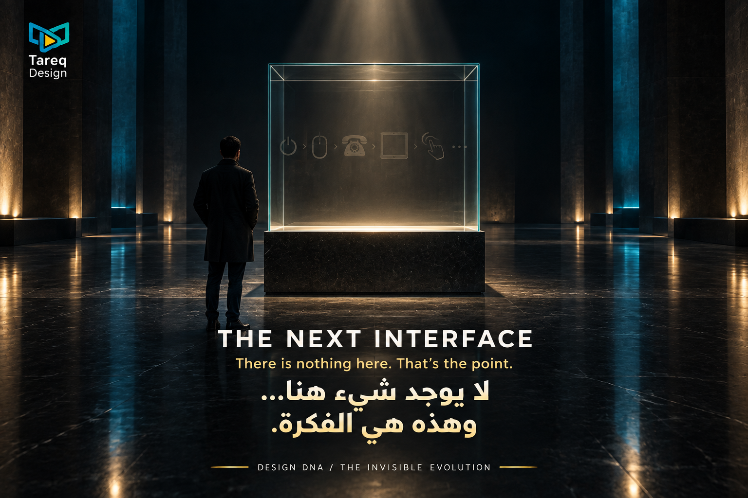
an empty glass case.
Its label reads:
THE INTERFACE
But there is nothing inside.
Why?
Because decades of interaction design seem to follow a fascinating trajectory:
Button → Touch → Gesture → Voice → Vision → Context
First, we told machines what to do with buttons.
Then we touched them.
Then gestured.
Then spoke.
Now devices are beginning to understand our environment, context and intent.
Perhaps the next generation of interface design...
isn't a better screen.
It's needing the screen less often.
When Disappearing Becomes Success
Imagine a door that opens when you need it.
A car that knows your preferences before you sit down.
A camera that understands where you're looking.
A home that adjusts its lighting without making you find a switch.
An app that doesn't ask for information it already knows.
Enormous amounts of design exist behind each experience.
Yet the user sees less.
And that creates a strange paradox:
The more intelligent the system becomes...
the less visible its interface may need to be.