

Introduction
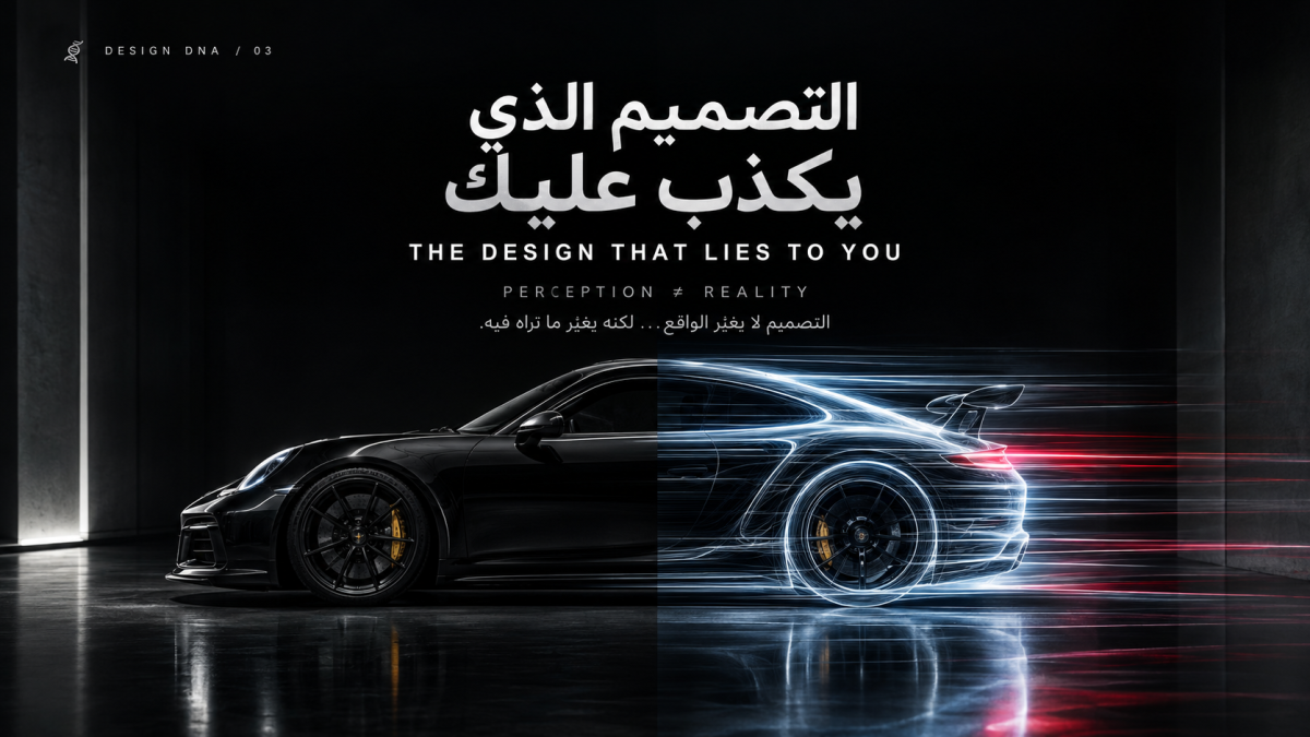
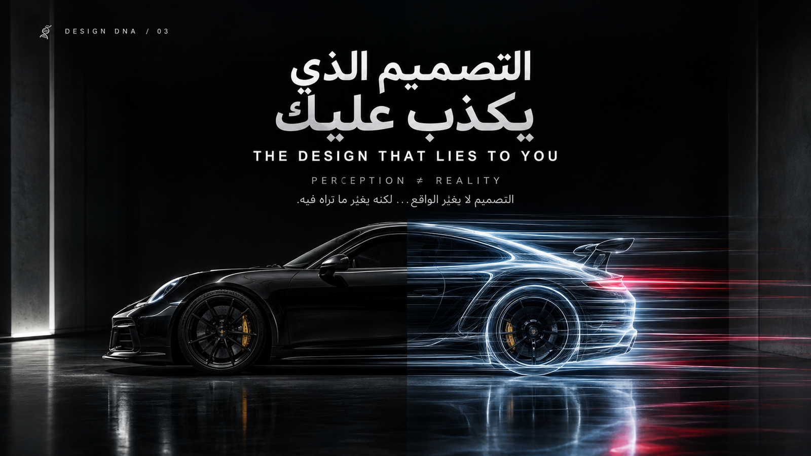
Look at a sports car standing still.
No engine running.
No wheels turning.
No sound.
And yet...
it looks fast.
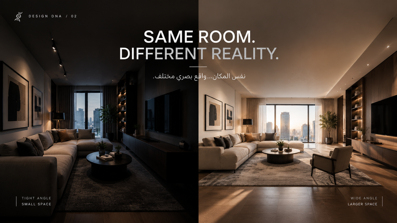
Look at a small room photographed with a wide lens.
It feels larger.
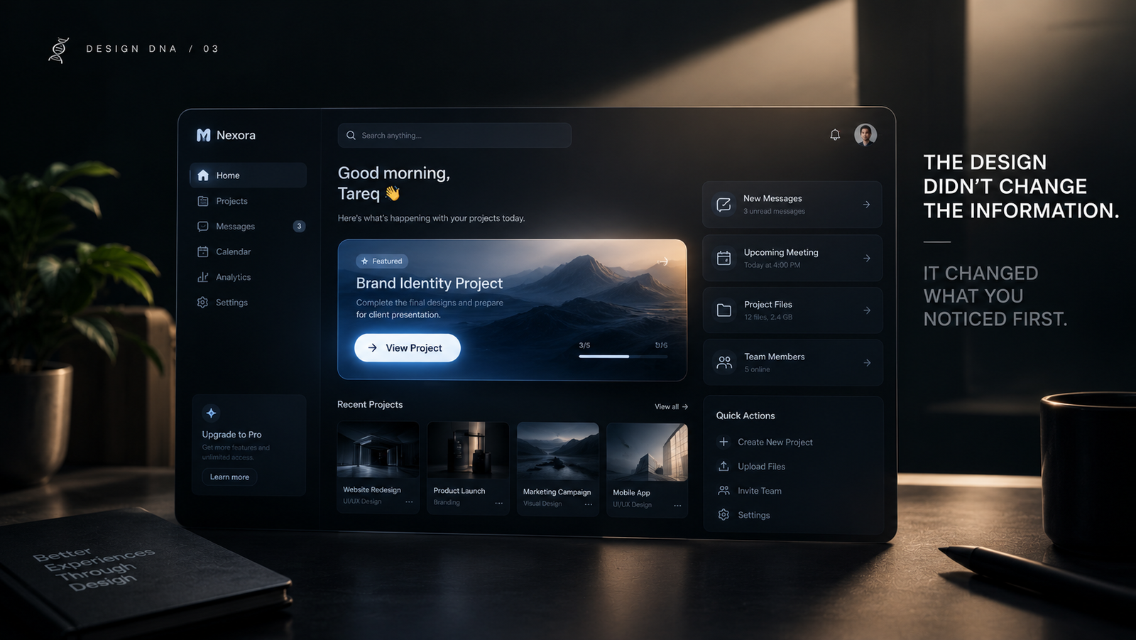
Look at one button among ten.
Make it slightly bigger, more contrasted...
and suddenly it feels more important.
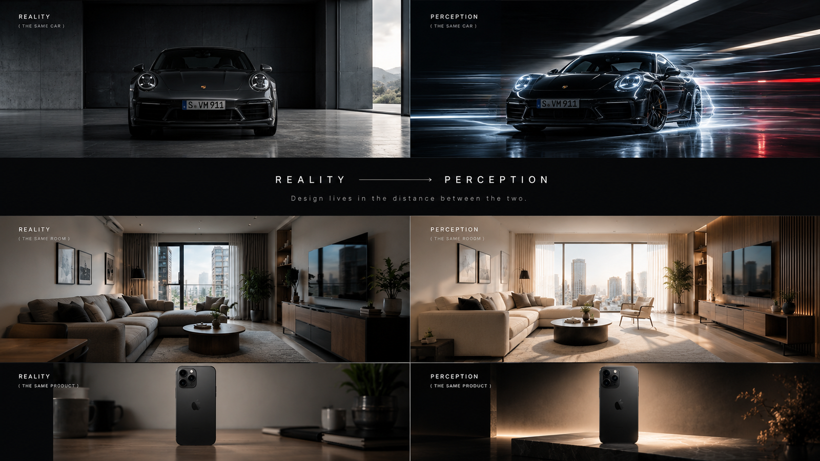
Reality didn't change.
The way design presented reality to your brain did.
And that's where the story begins.
Reality Doesn't Enter Your Eyes Directly
We like to think that the eye sees...
and then the brain understands.
It's more complicated than that.
Your brain rapidly organizes what you see into objects, groups, layers and meaningful relationships before conscious reading takes over. Spacing, alignment, similarity and motion can therefore alter how a screen is interpreted before you read a single word. Jakob Nielsen's UX
This gives designers an unusual kind of power.
They don't only decide what you see.
They can influence how you understand what you saw.
THE FIRST LIE
The Car That Isn't Moving
Why do some cars look fast while standing still?
Because speed isn't always movement.
It can be:
A line.
An angle.
A proportion.
Empty space ahead.
A body contour.
Even the direction of the front end can make your eyes expect motion.
The car isn't moving.
But its design creates the promise of movement.
That's exactly what we explored with Porsche.
The designer doesn't need to animate the car.
Sometimes it's enough to make your eye move before it does.
THE SECOND LIE
The Room That Became Bigger
Place a camera in the corner of a room.
Use a wide lens.
Separate objects visually.
Raise the ceiling inside the composition.
Leave empty space.
Suddenly...
the same room feels larger.
Not one square meter changed.
But the image gave you a different version of the space.
Photography isn't merely recording reality.
It is reconstructing it.
The photographer decides:
What appears?
What disappears?
What feels close?
What feels distant?
Where does your eye go first?
The image doesn't simply say:
"This is reality."
It says:
"This is how I want you to see reality."
THE THIRD LIE
The Button That Became More Important
Open a screen full of elements.
Make one button slightly larger.
Give it more contrast.
Surround it with space.
Place it at the end of the visual path.
You never explicitly told the user:
This is important.
Their brain understood it anyway.
This is one of design's most powerful functions:
Visual Hierarchy
The eye doesn't treat every element equally.
Size, contrast, color, position, motion and whitespace can change what we notice first and what we interpret as a priority. UX Encyclopedia
You may have twenty elements on the screen...
but the user sees one first.
Then another.
Then another.
You didn't change the information.
You changed the order in which reality was encountered.
THE FOURTH LIE
The Product That Became More Expensive
Put an ordinary product on a cluttered background.
Harsh lighting.
Cheap typography.
Too many visual elements.
Then take the exact same product.
Place it against calm negative space.
Use refined typography.
Soft lighting.
A carefully composed image.
Don't change the product.
Something strange happens.
The price your brain imagines changes.
The mind doesn't evaluate an object independently from the environment in which it appears.
Design creates context.
And context changes interpretation.
AND THAT'S WHEN THE LIE BECOMES USEFUL
The title of this article sounds negative.
But design doesn't always lie to manipulate you.
Sometimes...
it lies to help you.
When you make a button visually prominent, you're exaggerating its importance.
When you darken the background behind a modal, you're creating the perception that the window is in front.
When you add a shadow, you're creating depth that doesn't physically exist.
When you make similar elements appear as one group, you're helping the brain understand a structure it doesn't literally see as one physical object. These are practical applications of Gestalt-based perceptual principles in visual and interface design. IxDF - Interaction Design Foundation
So...
not every lie is a bad one.
Some lies are how we make truth easier to understand.
BUT THERE IS A DANGEROUS LIE
Design can go beyond guiding perception...
and become manipulation.
The Cancel button becomes nearly invisible.
The Subscribe button becomes enormous.
The real price is buried in tiny text.
The option the company wants becomes visually easier than the option the user wants.
Now design isn't helping the brain understand information.
It's helping the company control the decision.
And this is important:
The same power that makes design extraordinary...
can also make it deceptive.
The difference isn't the technique.
It's the intention.
DESIGN DOESN'T CHANGE REALITY
That's the paradox.
A designer can't make a car physically faster by drawing speed lines around it.
They can't make a room physically larger.
They can't make an ordinary product objectively better by choosing a luxury typeface.
But they can change how those things feel.
And sometimes...
that's enough to change behavior.
Because people don't always act on raw reality.
They act on reality as they perceive it.
THE IMAGE IS A BEAUTIFUL LIE
Take a photograph of food.
You can't smell it.
You can't taste it.
You don't know its temperature.
Yet one image can make you hungry.
Why?
Lighting.
Color.
Proximity.
Angle.
Texture.
Composition.
All of them construct an experience inside your mind that isn't physically happening in front of you.
And this is where the photographer and designer become almost the same person:
Both design perception.
THE DESIGNER DOESN'T JUST DESIGN THINGS
This may be the most important idea in the entire article.
A designer doesn't simply design:
A car.
A website.
A product.
A photograph.
An app.
They design the way that thing passes through the human mind.
What do you notice first?
What do you ignore?
What feels important?
What feels fast?
What feels expensive?
What feels easy?
What feels trustworthy?
That's why a design can be beautiful...
and still be bad.
And why something incredibly simple...
can be incredibly powerful.
Because beauty isn't the only material.
Perception itself is a design material.
CONCLUSION
After reading this, perhaps you won't trust your eyes in quite the same way.
You'll see a stationary car...
and look for the movement that never happened.
You'll enter a room...
and notice how the lens changed its scale.
You'll open an app...
and wonder why you saw one button before another.
You'll see a luxury product...
and try to discover exactly where your brain started increasing its price.
But don't worry.
Design didn't necessarily lie to you.
Perhaps it did something more interesting.
It gave you a new reality to see.
And that may be the real power of design:
Design doesn't change the truth.
It decides which version of it you get to see.
🧬 Design DNA Extract
- Design doesn't merely transmit reality; it influences how reality is interpreted.
- Perception can begin organizing visual information before conscious reading. Jakob Nielsen's UX
- Size, contrast, proximity, similarity, position and motion can establish hierarchy before we process the content consciously. IxDF - Interaction Design Foundation
- Design can create a sense of speed, depth, scale or importance without physically changing reality.
- Some visual "lies" are useful because they make information easier to understand.
- When perception is used to manipulate rather than clarify, design can become deceptive.
- Great designers don't just design objects; they design the perception surrounding them.
🧬 DNA Thought
Design doesn't change the truth.
It decides which version of it you get to see.